OUR BRAND STORY
Hover over the logo to see our brand transformation


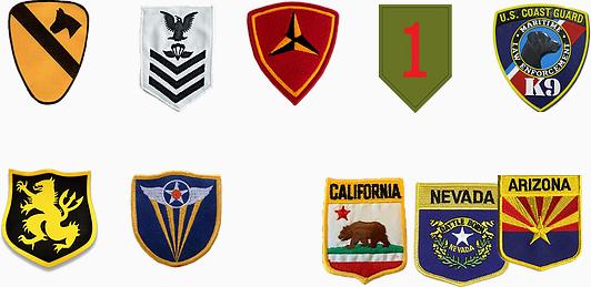
Hover over the sample shoulder patches to see the symbolism of our new logo

Our Brand Colors
Gedunk Brown
#45433DGedunk Brown #45433D
Gedunk (‘GEE dunk) is military slang for a candy bar or other snack or junk food items, or a snack bar where such items are sold. One of the leading theories on the term’s origin is a German word meaning to dunk bread in gravy or coffee.
California Gold
#DBAB58California Gold
#DBAB58
Represents our Northern CA origins and the low, rolling hills of Sonoma County where the company was founded by a group of Vietnam veterans in 1972 under the name Flower of the Dragon, with a $9,000 budget that launched a 48-year (and counting) mission to help veterans reintegrate into civilian life.
Home At Last Blue
#424757Home At Last Blue
#424757
For many veterans, “home” is more than a physical structure. Home is a feeling, and the journey to get there is a search for peace, purpose, health, identity and community. The ancient Greeks called it “a return to light and life.” In color psychology, this shade of blue encourages wisdom, spirituality and self-mastery, as well as a sense of structure and tradition.
Desert Tan
#B49D80Desert Tan
#B49D80
Represents the desert combat boots, cammies, body armor and flight suits worn by American troops during Desert Storm and the post-9/11 wars in Iraq and Afghanistan.
Hoa Binh Green
#3E5743Hoa Binh Green
#3E5743
Represents our founding in 1972 by a group of Vietnam veterans, as well as our ongoing work in Vietnam’s Hoa Binh (hwa ‘BEAN) province, where we’ve built three schools and a health clinic. Hoa Binh, which means “peace,” is a mountainous region with lush, green valleys and dense forest.
FAQ’s
Be the first to know.
Be the first to know.
Get our latest news and updates.

